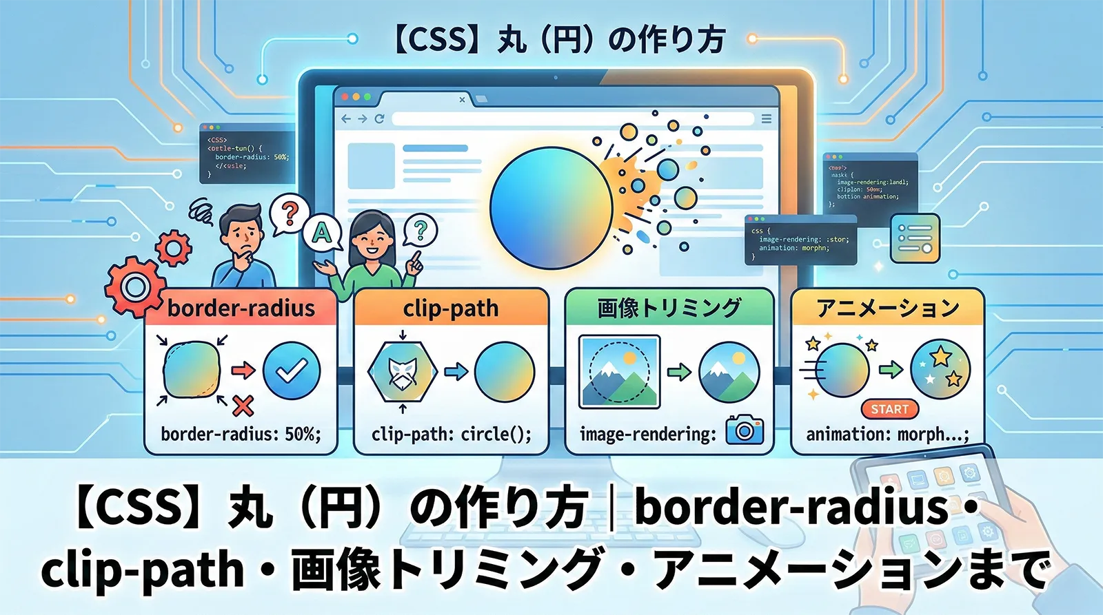
CSSで丸(円)を作る方法は1つではありません。border-radius: 50% の基本から、レスポンシブ対応・画像トリミング・アニメーション・プログレスバーまで、シーンによって最適な実装が変わります。
この記事では、初心者が最初に覚えるべき基本から、日本語の解説記事にほとんど存在しないモダン手法まで、実装デモ付きで10パターンを完全解説します。
・border-radius: 50% で正円を作る基本構文
・aspect-ratio: 1 でwidthだけ指定して正円を保証する方法(モダン手法)
・clip-path: circle() の使い方と border-radius との使い分け
・vw + clamp() でレスポンシブな円を作る方法
・object-fit: cover で画像を円形にトリミングする方法
・shape-outside: circle() でテキストを円形に回り込ませる方法
・conic-gradient で円形プログレスバーを作る方法
・pulse・回転ボーダー・ホバー拡大アニメーションの実装
・CSS vs SVG の使い分け基準
- 基本:border-radius: 50% で正円を作る
- aspect-ratio: 1 で正円を確実に維持する(モダン手法)
- clip-path: circle() で円を切り抜く
- レスポンシブな円を作る(vw・clamp)
- 画像を円形にトリミングする(object-fit)
- テキスト入り円(Flexbox で中央揃え)
- 枠線付き円・二重円
- グラデーション背景の円
- 半円・四分円・楕円
- shape-outside: circle() でテキストを円形に回り込ませる
- conic-gradient で円形プログレスバーを作る
- 丸バッジ・通知アイコン
- FABボタン(フローティングアクションボタン)
- 円のアニメーション
- CSS vs SVG:どちらで円を作るべきか
- よくあるトラブルと解決法
- よくある質問
- まとめ
- あわせて読みたい
基本:border-radius: 50% で正円を作る
CSSで丸を作る最もシンプルな方法は、正方形の要素に border-radius: 50% を指定することです。
<div class="circle"></div>
.circle {
    width: 80px;
    height: 80px;
    background: #3b82f6;
    border-radius: 50%;
}
border-radius: 50% は四隅すべてを要素サイズの50%で丸めるため、正方形(width = height)に適用すると完全な正円になります。
width と height に異なる値を指定すると、border-radius: 50% は正円ではなく楕円になります。正円を保証するには必ず同じ値を指定してください。border-radius の値による違い
| 指定値 | 意味 | 結果の形状 |
|---|---|---|
50% |
要素サイズの50%で角を丸める | 正円(width = height のとき) |
9999px |
十分に大きな固定値 | 正円(50%と実質同じ) |
50% / 30% |
水平方向/垂直方向を別々に指定 | 楕円 |
25% |
サイズの25%で角を丸める | 角丸四角形 |
50% を推奨します。9999px はボタンなどの「両端が半円のピル型」に使われることが多いです。aspect-ratio: 1 で正円を確実に維持する(モダン手法)
aspect-ratio: 1 を使うと、height を省略しても自動的に正方形を維持できます。特にレスポンシブデザインで width をパーセントや可変値で指定する場面で便利です。
/* height 省略可。width だけ変えれば常に正円 */
.circle-aspect {
    width: 80px;
    aspect-ratio: 1;     /* = 1 / 1 と同義 */
    background: #ef4444;
    border-radius: 50%;
}

/* 幅をパーセント指定してもアスペクト比で高さが自動計算される */
.circle-percent {
    width: 20%;
    aspect-ratio: 1;
    background: #f97316;
    border-radius: 50%;
}
①
width: Xvw など画面幅に依存する可変サイズの円② JavaScript で動的にサイズを変更する円
③ CSS Grid / Flexbox レイアウトで自動的にサイズが決まる円
※ Chrome 88+, Firefox 89+, Safari 15+ 対応(IE 非対応)
clip-path: circle() で円を切り抜く
clip-path: circle() は要素を円形に「切り抜く」方法です。border-radius とは仕組みが異なり、要素の外にはみ出た部分が完全に非表示になります。
.circle-clip {
    width: 80px;
    height: 80px;
    background: #22c55e;
    clip-path: circle(50%);
}

/* 中心位置を変えることもできる */
.circle-clip-offset {
    width: 80px;
    height: 80px;
    background: #8b5cf6;
    clip-path: circle(40% at 60% 40%);  /* 半径40%, 中心を右上寄りに */
}
border-radius vs clip-path:どちらを使うべきか
| 比較項目 | border-radius: 50% | clip-path: circle() |
|---|---|---|
| 仕組み | 角を丸める(ボックスモデルは正方形のまま) | 図形で切り抜く(外側は消える) |
| border(枠線) | 円形の枠線を表示できる | 切り抜かれるため枠線が消える |
| box-shadow | 円形の影が表示される | 切り抜かれるため影が消える |
| クリック領域 | 正方形のまま(四隅も反応) | 円形のみ反応 |
| アニメーション | border-radius の変化を遷移できる |
circle() の半径を遷移できる |
| テキスト溢れ制御 | overflow: hidden が必要 |
切り抜きで自動制御 |
| IE11 対応 | 対応 | 非対応 |
border-radius。クリック領域を円形に限定したい・テキスト溢れを切り抜きで制御したい・clip-path のアニメーションを使いたい場合は clip-path: circle()。レスポンシブな円を作る(vw・clamp)
画面幅に応じてサイズが変わるレスポンシブな円は、vw 単位または clamp() 関数で実現できます。日本語の解説記事でまともに取り上げているものはほとんどありません。
vw 単位で画面幅に連動する円
.circle-vw {
    width: 15vw;      /* 画面幅の15% */
    aspect-ratio: 1;  /* height は自動計算 */
    background: #06b6d4;
    border-radius: 50%;
}
clamp() で最小・最大サイズを制限する
clamp(最小値, 推奨値, 最大値) を使うと、小さすぎ・大きすぎを防げます。
.circle-clamp {
    /* 最小40px, 推奨10vw, 最大120px */
    width: clamp(40px, 10vw, 120px);
    aspect-ratio: 1;
    background: #d946ef;
    border-radius: 50%;
    display: flex;
    align-items: center;
    justify-content: center;
    color: #fff;
    font-size: clamp(12px, 2.5vw, 24px);  /* テキストも連動 */
}
コンテナクエリで親要素基準のレスポンシブ円
.card {
    container-type: inline-size;
}

.card .avatar {
    width: 20cqi;  /* 親コンテナ幅の20% */
    aspect-ratio: 1;
    border-radius: 50%;
    object-fit: cover;
}
・
vw:ページ全体の画面幅に連動させたい・
clamp():最小・最大サイズを制限してスマホでも崩れないようにしたい・
cqi(コンテナクエリ):カード内・モーダル内など親要素基準でサイズを決めたい※ cqi は Chrome 105+, Safari 16+ 対応
画像を円形にトリミングする(object-fit)
プロフィール画像やアバターを円形にトリミングする実装です。object-fit: cover と組み合わせることで、縦横比に依存せず常に丸く切り抜けます。
<img src="photo.jpg" alt="プロフィール画像" class="avatar">
.avatar {
    width: 100px;
    height: 100px;
    border-radius: 50%;
    object-fit: cover;          /* 縦横比を保ちつつ全体をカバー */
    object-position: center;    /* 中央を基準にトリミング */
    display: block;             /* img 要素の下部余白を消す */
}
枠線付きのプロフィールアバター
.avatar-bordered {
    width: 100px;
    height: 100px;
    border-radius: 50%;
    object-fit: cover;
    border: 3px solid #fff;
    box-shadow: 0 0 0 2px #3b82f6;  /* 枠線 + 外側のリング */
}
テキスト入り円(Flexbox で中央揃え)
丸の中にテキストを配置する場合は Flexbox の align-items: center・justify-content: center で水平・垂直中央揃えにします。
<div class="circle-text">CSS</div>
.circle-text {
    width: 80px;
    height: 80px;
    background: #8b5cf6;
    border-radius: 50%;
    color: #fff;
    font-weight: bold;
    font-size: 18px;
    display: flex;
    align-items: center;
    justify-content: center;
}
テキスト量に応じて自動でサイズが変わる円(aspect-ratio 活用)
.circle-auto {
    display: inline-flex;
    align-items: center;
    justify-content: center;
    min-width: 48px;
    min-height: 48px;
    padding: 10px;
    aspect-ratio: 1;           /* 幅=高さを維持 */
    background: #f59e0b;
    border-radius: 50%;
    color: #fff;
    font-weight: bold;
    line-height: 1;
}
枠線付き円・二重円
border / box-shadow / outline の使い分け
/* border: 要素サイズが変わる(box-sizing: content-boxのとき) */
.circle-border {
    width: 80px;
    height: 80px;
    border-radius: 50%;
    border: 3px solid #3b82f6;
    background: transparent;
}

/* box-shadow: レイアウトに影響しない */
.circle-box-shadow {
    width: 80px;
    height: 80px;
    border-radius: 50%;
    background: #f0f9ff;
    box-shadow: 0 0 0 3px #3b82f6;  /* spread-radius で太さを指定 */
}

/* outline: レイアウトに影響しない + border-radius に追従(Chrome/Firefox) */
.circle-outline {
    width: 80px;
    height: 80px;
    border-radius: 50%;
    background: #eff6ff;
    outline: 3px solid #6366f1;
    outline-offset: 4px;    /* 要素から離して配置 */
}
border
box-shadow
outline
| 手法 | レイアウトへの影響 | 主な用途 |
|---|---|---|
border |
あり(要素サイズに加算) | 通常の枠線。色・幅・スタイルを細かく指定 |
box-shadow |
なし | 重ね枠線(複数指定可)。アニメーションにも使いやすい |
outline |
なし | フォーカス表示・offset で内外に配置 |
box-shadow で二重円・多重円を作る
/* カンマ区切りで複数の枠線を重ねられる */
.circle-double {
    width: 80px;
    height: 80px;
    border-radius: 50%;
    background: #3b82f6;
    box-shadow:
        0 0 0 5px #fff,         /* 白い間隔 */
        0 0 0 8px #3b82f6,      /* 2重目の枠 */
        0 0 0 13px #fff,        /* 白い間隔 */
        0 0 0 16px #93c5fd;     /* 3重目の枠 */
}
グラデーション背景の円
background にグラデーションを指定するだけで、鮮やかなグラデーション円が作れます。
/* linear-gradient: 方向を指定したグラデーション */
.circle-grad-linear {
    width: 80px;
    height: 80px;
    border-radius: 50%;
    background: linear-gradient(135deg, #667eea, #764ba2);
}

/* radial-gradient: 中心から広がるグラデーション */
.circle-grad-radial {
    width: 80px;
    height: 80px;
    border-radius: 50%;
    background: radial-gradient(circle, #f093fb 0%, #f5576c 100%);
}

/* グラデーション枠線(::before 疑似要素を使う方法) */
.circle-grad-border {
    width: 80px;
    height: 80px;
    border-radius: 50%;
    background: #fff;
    padding: 3px;   /* 枠線の太さ */
    background-image: linear-gradient(#fff, #fff),
                      linear-gradient(135deg, #667eea, #f5576c);
    background-origin: border-box;
    background-clip: padding-box, border-box;
    border: 3px solid transparent;
}
linear
radial
水色
半円・四分円・楕円
border-radius の個別指定で様々な形の円弧を作れます。
/* 上半円 */
.semicircle-top {
    width: 80px;
    height: 40px;   /* 高さを半分に */
    background: #3b82f6;
    border-radius: 80px 80px 0 0;  /* 上側だけ丸める */
}

/* 左半円 */
.semicircle-left {
    width: 40px;
    height: 80px;
    background: #ec4899;
    border-radius: 80px 0 0 80px;
}

/* 四分円(パックマン型) */
.quarter-circle {
    width: 80px;
    height: 80px;
    background: #22c55e;
    border-radius: 100% 0 0 0;  /* 左上のみ丸める */
}

/* 楕円 */
.ellipse {
    width: 120px;
    height: 60px;
    background: #f59e0b;
    border-radius: 50%;  /* 長方形に50%で楕円 */
}
上半円
左半円
四分円
楕円
shape-outside: circle() でテキストを円形に回り込ませる
shape-outside は要素の周囲へのテキスト回り込み形状を円形に変える CSS プロパティです。日本語の「CSS 円」解説記事でほとんど取り上げられていないモダンな機能です。
<div class="circle-float"></div>
<p>テキストが円形に沿って回り込みます。画像をプロフィール写真のように配置しながら、
テキストをその円形に合わせて綺麗に流し込む実装ができます。
雑誌やニュースサイトのようなリッチなレイアウトに使えます。</p>
.circle-float {
    float: left;          /* float が必須 */
    width: 120px;
    height: 120px;
    border-radius: 50%;
    background: #06b6d4;
    margin-right: 16px;
    shape-outside: circle(50%);  /* テキスト回り込み形状を円に */
}
・
float プロパティと組み合わせて使う必要がある・
shape-margin でテキストと円形の間隔を調整できる・Chrome, Firefox, Safari 対応(IE 非対応)
・
shape-outside: circle() の他に ellipse()・polygon() も使えるconic-gradient で円形プログレスバーを作る
conic-gradient(扇形グラデーション)を使うと、JavaScriptなしのCSSのみで円形プログレスバーが作れます。これも日本語の「CSS 円」記事ではほとんど紹介されていない差別化ポイントです。
/* 75% の進捗を示す円形プログレスバー */
.progress-circle {
    width: 120px;
    height: 120px;
    border-radius: 50%;
    background: conic-gradient(
        #3b82f6 75%,   /* 進捗部分(75%) */
        #e2e8f0 75%    /* 残り部分 */
    );
    display: flex;
    align-items: center;
    justify-content: center;
}

/* 中抜き(ドーナツ型)にする */
.progress-circle::after {
    content: "75%";
    display: flex;
    align-items: center;
    justify-content: center;
    width: 90px;
    height: 90px;
    border-radius: 50%;
    background: #fff;  /* 背景色で内側を塗りつぶす */
    font-weight: bold;
    font-size: 18px;
    color: #1e40af;
}
CSS カスタムプロパティで動的に変化させる
.progress-dynamic {
    --progress: 0%;   /* JavaScript から変更可能 */
    width: 120px;
    height: 120px;
    border-radius: 50%;
    background: conic-gradient(
        #3b82f6 var(--progress),
        #e2e8f0 var(--progress)
    );
}
/* JavaScript でパーセントを更新する例 */
/* element.style.setProperty("--progress", "75%"); */
丸バッジ・通知アイコン
SNSの通知数やカートの商品数などに使われる、要素の右上に重ねる丸バッジの実装です。
<div class="btn-with-badge">
    <span class="badge">3</span>
    通知
</div>
.btn-with-badge {
    position: relative;
    display: inline-flex;
    align-items: center;
    padding: 10px 20px;
    background: #3b82f6;
    color: #fff;
    border-radius: 6px;
    font-size: 14px;
    gap: 8px;
}

.badge {
    position: absolute;
    top: -8px;
    right: -8px;
    min-width: 20px;
    height: 20px;
    padding: 0 4px;
    aspect-ratio: 1;
    background: #ef4444;
    border-radius: 50%;
    color: #fff;
    font-size: 11px;
    font-weight: bold;
    display: flex;
    align-items: center;
    justify-content: center;
    line-height: 1;
    border: 2px solid #fff;   /* 親要素との境界を白で分離 */
}
FABボタン(フローティングアクションボタン)
Material Design で定番の、画面右下に固定表示する丸いフローティングアクションボタンの実装例です。
<button class="fab" aria-label="追加">+</button>
.fab {
    position: fixed;
    bottom: 24px;
    right: 24px;
    width: 56px;
    height: 56px;
    border-radius: 50%;
    background: #3b82f6;
    color: #fff;
    font-size: 28px;
    border: none;
    cursor: pointer;
    box-shadow: 0 4px 12px rgba(59, 130, 246, 0.5);
    display: flex;
    align-items: center;
    justify-content: center;
    transition: transform 0.2s ease, box-shadow 0.2s ease;
    z-index: 1000;
}

.fab:hover {
    transform: scale(1.1);
    box-shadow: 0 6px 20px rgba(59, 130, 246, 0.6);
}

.fab:active {
    transform: scale(0.95);
}
円のアニメーション
パルス(pulse)アニメーション
通知ドットや「オンライン中」インジケーターに使われる脈動アニメーションです。
.pulse {
    width: 16px;
    height: 16px;
    border-radius: 50%;
    background: #22c55e;
    position: relative;
}

.pulse::before {
    content: "";
    position: absolute;
    inset: 0;
    border-radius: 50%;
    background: #22c55e;
    animation: pulse 2s ease-out infinite;
}

@keyframes pulse {
    0%   { transform: scale(1);   opacity: 0.8; }
    100% { transform: scale(3);   opacity: 0; }
}
ホバーで拡大するアニメーション
.circle-hover {
    width: 80px;
    height: 80px;
    border-radius: 50%;
    background: #8b5cf6;
    transition: transform 0.3s ease, box-shadow 0.3s ease;
    cursor: pointer;
}

.circle-hover:hover {
    transform: scale(1.15);
    box-shadow: 0 8px 24px rgba(139, 92, 246, 0.5);
}
回転ボーダーアニメーション(ローディング)
.spinner {
    width: 48px;
    height: 48px;
    border-radius: 50%;
    border: 4px solid #e2e8f0;           /* ベースの薄い枠 */
    border-top-color: #3b82f6;           /* 上端だけ色を変える */
    animation: spin 0.8s linear infinite;
}

@keyframes spin {
    to { transform: rotate(360deg); }
}

/* グラデーションスピナー(よりリッチ) */
.spinner-gradient {
    width: 48px;
    height: 48px;
    border-radius: 50%;
    background: conic-gradient(transparent 0%, #3b82f6 100%);
    mask: radial-gradient(
        farthest-side,
        transparent calc(100% - 4px),
        #000 calc(100% - 4px)
    );
    -webkit-mask: radial-gradient(
        farthest-side,
        transparent calc(100% - 4px),
        #000 calc(100% - 4px)
    );
    animation: spin 0.8s linear infinite;
}
フェードイン・スケールアップで登場するアニメーション
.circle-appear {
    width: 80px;
    height: 80px;
    border-radius: 50%;
    background: #ec4899;
    animation: appear 0.5s ease-out both;
}

@keyframes appear {
    from { transform: scale(0); opacity: 0; }
    to   { transform: scale(1); opacity: 1; }
}
CSS vs SVG:どちらで円を作るべきか
Oracleで作成されたavatarなど特別なケースを除き、ほとんどの場面で CSS で十分です。SVGが必要なケースを整理します。
| 比較項目 | CSS(border-radius / clip-path) | SVG(<circle> 要素) |
|---|---|---|
| シンプルな丸 | ◎ 数行で実装可能 | △ タグ構造が複雑 |
| 塗りつぶし・枠線 | ◎ background / border で直感的 | ○ fill / stroke で制御 |
| グラデーション | ◎ CSS グラデーションが使える | ○ SVG linearGradient が使えるが記述が複雑 |
| テキスト中央配置 | ◎ Flexbox で簡単 | △ テキスト配置が複雑 |
| レスポンシブ | ◎ vw, %, clamp が使える | ◎ viewBox + preserveAspectRatio |
| アニメーション | ◎ CSS アニメーション | ◎ CSS/SMIL アニメーション(SVGが有利な場合も) |
| パスに沿って動く | × 不可 | ◎ animateMotion で実現 |
| 複雑な形(歯車など) | △ 限界がある | ◎ path 要素で自由自在 |
| アイコン用途 | △ 要素構造を使う必要がある | ◎ 専用形式・外部ファイル化できる |
| SEO・アクセシビリティ | ○ | ◎ role・title タグで意味付けできる |
よくあるトラブルと解決法
問題1:border-radius: 50% が効いても楕円になる
/* NG: 幅と高さが違う */
.ng { width: 120px; height: 80px; border-radius: 50%; }  /* → 楕円 */

/* OK: 幅と高さを同じにする */
.ok { width: 80px;  height: 80px; border-radius: 50%; }  /* → 正円 */

/* OK: aspect-ratio で高さを自動化 */
.ok2 { width: 80px; aspect-ratio: 1; border-radius: 50%; }  /* → 正円 */
問題2:img 要素の下に謎の隙間がある
/* img はインライン要素なので行ボックスの下部に隙間が生じる */
.avatar {
    display: block;  /* または vertical-align: bottom/top */
    border-radius: 50%;
    object-fit: cover;
}
問題3:overflow: hidden を忘れて子要素が円からはみ出す
/* 子要素が円からはみ出す場合 */
.circle-container {
    width: 100px;
    height: 100px;
    border-radius: 50%;
    overflow: hidden;   /* ← これを忘れると子が角から飛び出す */
}
問題4:clip-path で box-shadow が消える
/* clip-path は box-shadow を切り取ってしまう */
/* 解決策: filter: drop-shadow() を使う */
.circle-with-shadow {
    width: 80px;
    height: 80px;
    background: #3b82f6;
    clip-path: circle(50%);
    filter: drop-shadow(0 4px 8px rgba(0,0,0,0.2));
}
よくある質問
transform でスケールしている場合は will-change: transform を追加してGPU描画を強制すると改善するケースがあります。border-radius: 9999px を指定します。50% と異なり、高さよりも大きな px 値を指定するため、長方形に適用すると両端だけが半円になります。短辺が 40px なら border-radius: 9999px = border-radius: 20px と同じ効果になります。display: flex; flex-wrap: wrap; gap: 16px; が最もシンプルです。全て同サイズの円をきれいに並べる場合は display: grid; grid-template-columns: repeat(auto-fit, minmax(80px, 80px)); gap: 16px; も有効です。まとめ
| 手法 | 使うプロパティ | 主な用途 |
|---|---|---|
| 基本の正円 | border-radius: 50% |
汎用の丸。最も対応ブラウザが広い |
| 正円を確実に保証 | aspect-ratio: 1 |
レスポンシブ・動的サイズ変更 |
| 円形切り抜き | clip-path: circle(50%) |
クリック領域を円形に。アニメーション |
| vw・clamp レスポンシブ | width: clamp() + aspect-ratio |
画面幅に応じてサイズが変わる円 |
| 画像を円形に | border-radius + object-fit: cover |
アバター・プロフィール写真 |
| テキスト回り込み | shape-outside: circle() |
雑誌風レイアウト・プロフィール紹介 |
| 円形プログレスバー | conic-gradient |
スキルチャート・ローディング |
| 丸バッジ・通知 | position: absolute + 円 |
SNS通知数・カート数 |
| FABボタン | position: fixed + 円 + box-shadow |
フローティングボタン |
| アニメーション | @keyframes + animation |
パルス・スピナー・ホバー |